Software UX/UI Redesign and Rebranding
When my team was approached with this challenge, HiveWise was a research prototype called the Deliberatorium, designed and developed by a team at MIT. The goal was to analyze the platform and re-work it to be viable for commercial applications.
I was responsible for Strategic Research Information Architecture, UI, Prototyping, User Testing, and Visual Design for this project.
“Current open innovation technologies fail badly when dealing with complex problems and large groups. The fundamental challenge, ironically, is super-abundance: crowds generated so many ideas that it becomes difficult to manage the process and harvest the best ideas.”
Defining the challenge...
Before my team was brought on to the project, the Deliberatorium had already been tested with with several large groups including Intel, the Federal Bureau of Land Management, and the Italian Democratic Party. These tests served as a proof of concept, but user feedback indicated that the structure was difficult to understand, and the UI would need to be overhauled for the platform to be useable, much less commercially viable.
6/6
Of the six original Deliberatorium testers interviewed, all six indicated that the layout and style negatively effected their experience.
“It has a learning curve that people may not be willing to invest in. It’s also not beautiful and so many interfaces are beautiful and fun to use.”
“The ‘look’ is the biggest issue with the Deliberatorium. When you look at the Deliberatorium you think PC, but it should be MAC.”
On the shoulders of giants...
The discovery process for this project was particularly sensitive. The core functionality of the Deliberatorium is based on over a decade of research on Argumentation Theory from the Collective Intelligence lab at MIT. With only a couple of weeks to produce a redesigned prototype, it was clear that we needed to wrap our heads around the concept quickly. This sounded like an exciting challenge, so I was more than happy to volunteer to dig in and try to grasp the theory.
In a nutshell, the Deliberatorium promotes meaningful conversation at a large scale by guiding users to gather their thoughts around specific topics, and categorize their input in a structured hierarchy. This gives both users and researchers the ability to spend less time sifting through unorganized and repetitive comment threads, and more time engaging new ideas. As a side effect, little room is left for the unproductive and often abusive dialogue that internet message boards are known for.
Assembling the pieces...
With the core concept coming into focus, the challenge became to design an interface that our users could easily navigate and interact with. I preformed an analysis of over 30 platforms that focus on brainstorming, mind mapping, content organization, and large-scale messaging, trying to identify design patterns for visually organizing large volumes of user generated content. This process almost stalled the project as I became overly focused on feature analysis, and the team began to succumb to scope creep. We quickly refocused our efforts and used this research to identify a few key platforms that share goals and struggles with with the Deliberatorium.
By analyzing these other platforms I realized that biggest hurdle was scalability. It’s hard enough to keep a small group on topic, but the problem grows exponentially with scale. The hierarchical structure offered to the users aims to keep the conversation on track and free of redundancy, but some policing is still required. To solve this problem, the Deliberatorium had been appointing moderators to review and approve every single post.
Finding the friction...
Moderators from the original test groups indicated that a small fraction of incoming posts required editing due to either improper placement, redundancy, unclear wording, or abusive content. For this reason, the Deliberatorium required that moderators approve each post before it can be published. This created frustratingly long wait times for users' posts to enter the conversation, and these wait times become longer as engagement increases.
Designing for scalability...
To solve these problems, I had to to minimize the function of the moderator. By implementing some basic automated text recognition functionality and community-driven content flagging, users who are producing well formulated content can post with little to no friction, and the small pool of users whose posts need attention can receive prompt moderator feedback. I consulted with a couple of data scientists to work out the feasibility of our requirements and learned that this functionality would be fairly uncomplicated to implement.
Taking Shape...
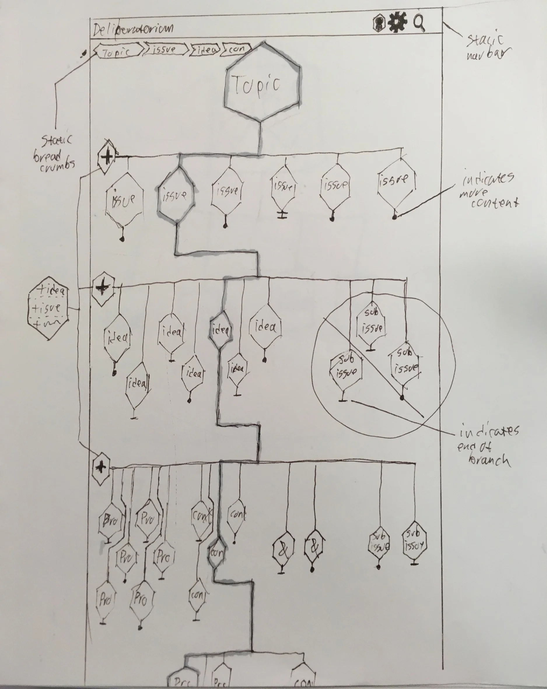
I spent a long time throwing ideas against the wall to see what would stick, incorporating some of the more well trodden IA patterns that showed up in my competitive analysis. There were some architectures that proved to be far better able to handle the deeply nested structure of the Deliberatorium without losing the user on the way.
And then there were three…
After dozens of rounds of guerrilla user testing and interviews, there were three patterns that were strongly preferred. Much to my consternation, of these three patterns there was no obvious favorite and each seemed to be preferred by three loose groups.
Card Interface:
With a card-based interface, every piece of content is treated as an object within the hierarchy to be interacted with. Users are restricted to viewing a single branch of related content. This keeps the amount of content that the user is confronted with at any one time from becoming too overwhelming, but has the side effect of making cross-referencing between separate branches of content difficult. This seemed to be the most popular interface by a slim margin, and was generally the preference of users in their 30s and 40s, working in non-technical fields.
List Interface:
The "list" interface functions like a nested outline of all of the available content within a topic. This interface was the preference of people in academic and technical fields. This is most similar to the original Deliberatorium interface, and better serves users who are analyzing the content rather than engaging with it.
Map Interface:
The map interface is laid out somewhat like an expandable mind map. It functions similarly to the nested "list" interface, but it spreads out into a more free form expression of the content and interconnected hierarchy. This interface was generally preferred by younger users and people in creative fields. Most users enjoyed playing with this interface as it is the most “fun”, but most users preferred the other options for extended or “serious” use.
A fresh coat of paint..
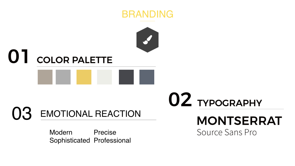
As the interface began to come together we needed address the elephant in the room. Users indicated that the aesthetic was an issue, one user comparing the look and feel to “Windows 95”. Another issue was the name, users found it to be “confusing” and “unmemorable”. The team decided that we needed to suggest a complete rebranding. I created a visual identity playing on a motif of bees and hives, nodding to the concept of collective intelligence. I also added some light animations to help underline important transitions and interactions. To match this new identity, I suggested that the platform be renamed HiveWise.
Bringing it home…
Finally, things started to fall in to place. I came to the realization that the three preferred designs could work in concert, providing users with their preferred experience while leaving the option open to engage in a different way. I may have come to this conclusion (and a few others) sooner if I had thought to include file organization systems like Finder or Google Drive in my competitive analysis.
Check out the clickable prototype HERE.


